This case study will highlight how different analyses of the same survey data can lead to different conclusions often resulting in wrong decisions. Not everything is, what it seems, when analysed in the proper way. with the wilcoxon-test.
Why is 58% customer satisfaction not better than 54%?
Why is 58% customer satisfaction different to 58%?
If you want to find out why, read on.
At MyInsurance, survey results have been collected in 2017, 2018 and 2019. The rating was done on a 10-point Likert ranging from 1 … very poor to 10 … outstanding. As always, the upper 3 points, i.e. 8, 9 and 10, are seen as customer is satisfied. All other ratings are undesirable. How did MyInsurance do over the years?
Since MyInsurance was working hard on improving many areas that have been commented by customers over the last years, they want to know whether the investments of work and money are paying off.
The question is not, “Does it look like we have improved?” but “Are we sure there is an improvement in customer satisfaction?”
In data analytics, two facts are interesting about this improvement:
Firstly, is it significant?
Secondly, is it large enough to have business impact?
Data Acquisition
The data have been collected using cloud-based systems.
MyInsurance is especially interested in the new market in Thailand where they see growth potential. Since the customer base is still quite small and new prospects are not helpful when it comes to this survey, they have only sent out some thousand emails with the invitation to rate.
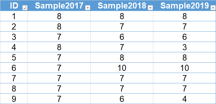
With a quite low response rate, for each year there are only 280 ratings that are organised in one column per year.
The data is downloaded from the MySQL server in the cloud and organised in an Excel table as shown. Since the analysis is to be done using R and R Studio, data is read into the R environment.
Load Data into R and Stack Columns Read More
# Loading necessary library if(! “readxl” %in% installed.packages()) { install.packages(“readxl”, dependencies = TRUE) } library(readxl) # Read Data from Excel Table into R dataframe Great Great <- read_excel(“Great.xlsx”, sheet = “Great”, range = “A1:D281”)
# Load necessary library if(! “utils” %in% installed.packages()) { install.packages(“utils”, dependencies = TRUE) } library(utils) # Stack data in GreatStacked and ignore column ID GreatStacked <- stack(Great, select = -ID) # Create additional columns Satisfied/Non-Satisfied and counter GreatStacked$sat <- ifelse(GreatStacked$values > 7, “Satisfied”, “Non-Satisfied”) GreatStacked$num <- 1
After that, the data is available in R Studio as table with the name “Great”.
For many analytics functions, data need to be in a certain format, stacked or unstacked. Therefore, the unstacked data in Great is stacked into GreatStacked.
Data Analysis
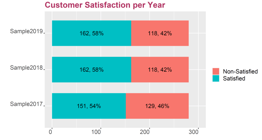
The analysis starts with the obvious calculation and plot of the customer satisfaction score per year.
Calculating Satisfaction Score Per Year
This calculation could easily be done in MS Excel. We chose the much more flexible R environment for this task.
# Plotting bar chart and turning it 90 degree library(ggplot2) ggplot(df, aes(x = factor(ind), y = n, fill = sat)) + geom_bar(position = position_stack(), stat = “identity”, width = .7) + geom_text(aes(label = label), position = position_stack(vjust = 0.5), size = 5) + ggtitle(“Customer Satisfaction per Year”) + labs(fill = “”) + theme(plot.title = element_text(color = “maroon”, size = 20, face=”bold”), text = element_text(color = “black”, size = 18, angle = 0, hjust = 1, vjust = 0)) + xlab(“”) + ylab(“”) + ylim(0, 300) + coord_flip()
It is obvious that the customer satisfaction score has gone up from 54% in 2017 to 58% in 2018 and 2019. That is good news, right? In a market with thousands of potential insurance customers, this should mean an increase in market share, right?
Not so fast!
Determining Significance of Improvement
An observed difference in a sample does not automatically allow us to conclude a difference in the underlying population. Since we only have a percentage and sample size, i.e. we have the number of satisfied versus non-satisfied customers for each year, we can apply a 2-proportion test. Because 2018 and 2019 show the same data, we compare between 2017 and the other two years in the same step.
Perform 2-Proportion Test in R Read More
# Compare proportions of Sample2017 with Sample2018/Sample2019 prop.test(x = c(151, 162), n = c(280, 280), p = NULL, alternative = “two.sided”, correct = TRUE)
This 2-proportion test is designed to find significant differences between groups of discrete data.
The p-value of this test determins that there is a risk of 39.47% for assuming a difference between the rating of 53.9% and 57.9% with the respective samples of 280 customers. Hence, if MyInsurance rewards their teams for the good work in increasing customer satisfaction, there is a risk of nearly 40% for this being wrong. There is even a small risk for the customer satisfaction in 2018/2019 being lower than in 2017.
Usually, this would be the final result: There is no evidence that customer satisfaction has improved from 2017 to 2018. There is no other way to read this result.
Analysing Survey Results as Percentages is a Last Resort!
Analysing Raw Data
In our special situation, we have obtained the raw data of the customer satisfaction rating for all three years. In oder to define, which tools should be deployed to perform further analysis steps, we need to identify whether our data follows normal distribution. This step seems not really critical since Likert-scale rating data hardly follows the bell shape. For demonstration purpose, we conduct a normality test.
There are many different tests for normality, that determine whether a set of data is similarly distributed as the bell shape described by Gauss in 1809. The Shapiro-Wilk normality test is a preferred one.
Perform Shapiro-Wilk Test on Normality in R Read More
# Perform Shapiro-Wilk normality test on all data in GreatStacked column values by ind with(GreatStacked, tapply(values, ind, shapiro.test))
Result:
$Sample2017 Shapiro-Wilk normality test W = 0.76188, p-value = 0.0000
$Sample2018 Shapiro-Wilk normality test W = 0.90083, p-value = 0.0000
$Sample2019 Shapiro-Wilk normality test W = 0.83921, p-value = 0.0000
It is imperative to test the normality of our three data sets separately. Mixing them into one dataset might render misleading results.
Since the p-values of all three Shapiro-Wilk normality tests are zero, none of the data is normal, as expected. Hence, we need to use tools for non-normal data in subsequent analyses.
Perform Wilcoxon-Test on Significant Differences of Central Tendency of Groups
Read More
# Perform Wilcoxon-test on GreatStacked values by ind library(rstatix) wilcox_test(GreatStacked, values ~ ind)
The Wilcoxon test compares the location (median and sequence) of non-normal data. This test performs pairwise comparisons between all different groups in the data frame.
As the p-values of the three tests suggest, the only significat difference in the rating was found between 2018 and 2019 customer satisfaction data.
Surprise 1
When comparing percentages using the 2-proportion test, no significant difference was identified, although in 2017 the customer satisfaction was with 54% lower than in 2018 and 2019 with 58%.
Surprise 2
Using the Wilcoxon-test, a significant difference was recognised between customer satisfaction in 2018 and 2019, although both show exactly the same satisfaction score of 58%.
Plotting the Data
An essential step in any data analytics is the graphical display of data. This does not mean, one graph will suffice. It means the data analyst needs to perform multiple plots in oder to reveal the truth lurking in the data.
Tally Raw Data and Plot Column Charts of Rating Details by Year Read More
# Tally data for each year df2017 <- Great %>% group_by(Sample2017, .drop=FALSE) %>% tally df2018 <- Great %>% group_by(Sample2018, .drop=FALSE) %>% tally df2019 <- Great %>% group_by(Sample2019, .drop=FALSE) %>% tally
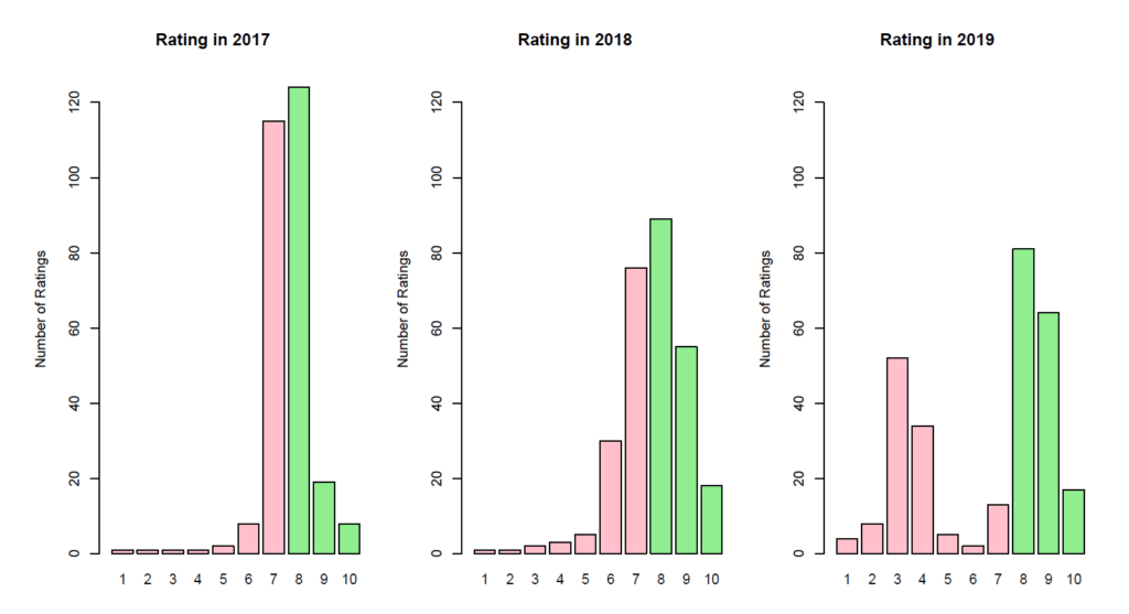
# Plot series of graphs for rating distribution barplot(height = df2017$n, names = df2017$Sample2017, xlab = “Rating”, xlim = c(0, 10), ylim = c(0, 130), ylab = “Number of Ratings”, main = “Rating in 2017”, col = c(“pink”, “pink”, “pink”, “pink”, “pink”, “pink”, “pink”, “lightgreen”, “lightgreen”, “lightgreen”)) barplot(height = df2018$n, names = df2018$Sample2018, xlab = “Rating”, xlim = c(0, 10), ylim = c(0, 130), ylab = “Number of Ratings”, main = “Rating in 2018”, col = c(“pink”, “pink”, “pink”, “pink”, “pink”, “pink”, “pink”, “lightgreen”, “lightgreen”, “lightgreen”)) barplot(height = df2019$n, names = df2019$Sample2019, xlab = “Rating”, xlim = c(0, 10), ylim = c(0, 130), ylab = “Number of Ratings”, main = “Rating in 2019”, col = c(“pink”, “pink”, “pink”, “pink”, “pink”, “pink”, “pink”, “lightgreen”, “lightgreen”, “lightgreen”))
Never Forget: Plot the Data, Plot the Data, Plot the Data
This plot reveals the reason for the significant difference found between the rating of customer satisfaction in 2018 and in 2019. Whereas rating in 2018 shows a more or less homogenious distribution of all raters with the majority rating around 6, 7, 8 and 9, the rating in 2019 reveals two different clusters, a “good” one and a “bad” one. The cluster with the rather good rating is located around 7 to 10. The cluster with the rather bad rating is located around 3 and 4.
In this kind of situation, the data analyst needs to find out, how this difference is made. The answer often is something like process change, different teams, different locations, etc.
Business Decision
After thorough analysis, the information generated by the data analyst can be used for business conclusions at MyInsurance. The following recommendations are to be considered:
There is no evidence that the customer satisfaction has increased from 2017 to 2018 or 2019. Any reward for successful work would come with a risk of being wrong of about 39.5%. Any celebration would be premature.
There has been a significant change from 2018 to 2019. In 2018, a homogenious rating pattern could be observed. In 2019, two clusters are obvious. There must be further investigation to identify the root causes for that change and especially for the clusters.
Survey data analysis should not rely on percentages only. Either your data analyst or your market research partner must perform in-depth analyses.
Never forget to plot the data.
Data Analytics for Organisational Development
If you wish to explore more cases of supporting organisational development with data analytics using MS Excel, MS PowerBI and R, if you wish to download the raw data for this and many other cases and if you wish to follow through the analysis step by step, these books might be of interest for you.
We use cookies to enhance your experience while using our website. If you are using our Services via a browser you can restrict, block or remove cookies through your web browser settings. We also use content and scripts from third parties that may use tracking technologies. You can selectively provide your consent below to allow such third party embeds. For complete information about the cookies we use, data we collect and how we process them, please check our Privacy Policy
Youtube
Consent to display content from - Youtube
Vimeo
Consent to display content from - Vimeo
Google Maps
Consent to display content from - Google
Spotify
Consent to display content from - Spotify
Sound Cloud
Consent to display content from - Sound
We use cookies to enhance your experience while using our website. To learn more about the cookies we use and the data we collect, please check our Privacy Settings.