The job of purchasing is obviously to source for reliable suppliers who deliver products conforming to specification on time within a certain price range. The more data is available about potential suppliers the better the decision will be. However, how shall the data be analysed?
FridgeMaker used to get supplies of a very crucial part, the Spacer, from Supplier X. Unfortunately, over the last months Supplier X has been struggling with waves of reorganisation resulting in unreliable deliveries and hence line stoppages for FridgeMaker.
FridgeMaker used to get supplies of a very crucial part, the Spacer, from Supplier X. Unfortunately, over the last months Supplier X has been struggling with waves of reorganisation resulting in unreliable deliveries and hence line stoppages for FridgeMaker.
FridgeMaker is looking for new suppliers for all parts coming from Supplier X. Purchasing has already started the supplier qualification process for the Spacer (10.5 +/-0.3) and has received parts from suppliers A, B and C. The data are shown here. Following this data purchasing can make their decision on price. All of the suppliers meet the requirements set out in the tender document.
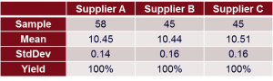
Table 1: Supplier Qualification Data for Spacer (USL=10.8, LSL=10.2)
Never Forget to Plot the Data
If we would take a closer look at the samples we have got from the suppliers we would probably reconsider our decision. Firstly, it is always beneficial to evaluate the distribution, the shape, of any given data set. Histogram, dot plot and box plot are simple tools to perform this task. Checking the histograms in figure 1 does not reveal any new findings. Due to the characteristic of a histogram it can only give valuable information if it is based on a certain number of data, i.e. hundred or more. Dot plot does not help either.
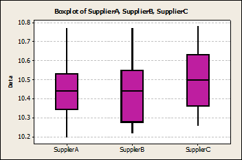
Figure 2: Box Plots of Spacer Data
Plotting the data in a box plot gives some more information: Supplier A seems to run the most capable process with the lowest variation (see Standard Deviation in table 1). Supplier B runs a process that does not look symmetric hence data do not seem to be normally distributed. Whilst there are certainly processes that do not “produce” normal data by nature, the Spacer process should definitely do so.
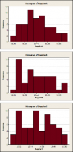
Figure 1: Histograms of Spacer data for Supplier A, B and C
Supplier A seems to have a “smooth” process delivering stable and capable data.
Supplier B would have a similar process if it would not show an “unusual pattern” at the lower specification limit. This pattern is usually not a result of an undisturbed process, but is “man made”. In this case it would be a good bet to assume that supplier B has filtered out the data below the lower specification limit by the means of inspection. Since the data is normal, only the pattern of the plot would disclose this “heads up”.
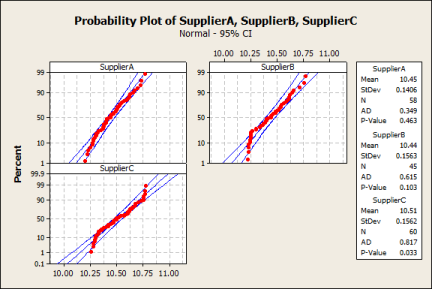
Figure 3: Normal Probability Plots of Spacer Data
Supplier C does not show normal data although the nature of the process would usually demonstrate this common behaviour. The reason may lie in a process factor that drives this non-normality. The pattern of the normality plot suggests something like a change in the process. The best plots to reveal changes over time are time series plots, run charts or control charts. Only in case you have received data in a time order from your supplier can you run this kind of plot.
Figure 4 shows control charts for all suppliers. Whereas supplier A and supplier B exhibit stable processes, supplier C data prove that there has been a change, a shift, in the process caused by altering a setting on the machine, use of two different machines etc. Further investigation together with the supplier needs to be done to find the truth.
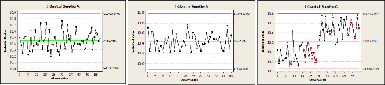
Figure 4: Control Charts of Spacer data for Supplier A, B and C
Most interestingly, supplier C would be able to deliver the best performance with the lowest process variation if the root cause for the shift would be eliminated and the process stabilised.
Conclusion
Very often we draw conclusions and make decisions based on a limited perspective on data only: we look at means and evaluate yield and defects. Some simple yet powerful tools can help to make much more out of the data available.
The first three steps of any data analysis shall be: Plot the Data, Plot the Data, Plot the Data.