Many companies spend a considerable amount of money on customer and employee surveys every year. The survey results are used to amend strategies, design new products and services, focus improvement activities, target staff development activities and … to celebrate success.
Since the impact of these results can be quite hefty the data driving important decisions shall be trustworthy. The question is: Can we always rely on what we see?
“Information is the oil of the 21st century, and analytics is the combustion engine.” Peter Sondergaard, Gartner
Great, We Have Improved … Or Not?
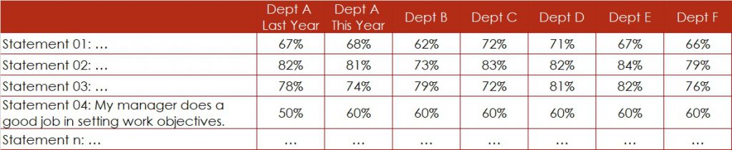
An organisation has completed their employee engagement survey. More than 70 statements have been rated by more than 500 employees, using a 5-point Likert Agreement Scale (1 … Strongly Disagree, 2 … Disagree, 3 … Neither, 4 … Agree, 5 … Strongly Agree). The survey result has been reported in percentage of favourable answers, i.e. % of rating 4 or rating 5.
The management team is screening the survey results especially for statement “My manager does a good job in setting work objectives”, since this used to be an area of weakness last year (Figure 1). For Department A, they conclude that the satisfaction level – the percentage of favourable ratings – has gone up from 50% last year to 60% this year.
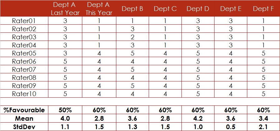
A small simulation for Statement 04 shows that rating results indicated in percentages can be lies. Why? In our example, the percentage of favourable ratings – the indicator %Favourable – goes up whilst the Mean of the rating drops. Statistics confirms that this drop comes with a p-value of about 8%, i.e. it is quite real. The increase of the percentage on the contrary has no foundation at all (Figure 3).
Do not trust percentages when you assess survey results. Evaluate averages instead.
We Got the Same Rating. That’s Great, Isn’t It?
The Managers of Department C and Department D recognise that their rating result for the above-mentioned statement is the same (Figure 1). They jokingly conclude that their management style – their target setting capability – must be very similar. Is this really true?
A look at the rating data reveals that the percentage might be the same, but the mean is totally different. The Manager at Department C receives a much lower rating for his performance management approach regarding setting work targets than the Manager at Department D.
Whilst Manager D got a rating much higher than average (3.0), his colleague performs below average. However, the percentage of favourable rating would not show this (Figure 3).
The difference between these two ratings is significant, i.e. statistically proven.
Again, do not trust percentages when you compare survey results. Compare averages instead.
We Cannot Trust the Survey Results in %. What About the Means?
The Managers at Department E and Department F listen to the explanation given to their colleagues at Department C and D. They get smart and compare not only the percentages of favourable ratings – which are both at 60% – but they also compare the means, that show 3.6 and 3.4, respectively (Figure 3). The managers conclude due to the small difference between the means that their style in setting work targets might be very similar since the rating is similar.
They have learned that small differences will most likely not get accepted by statistics as significant. Therefore, they conclude that there is no real difference. So, there is no reason for concerns.
Even this seems to be a wrong conclusion.
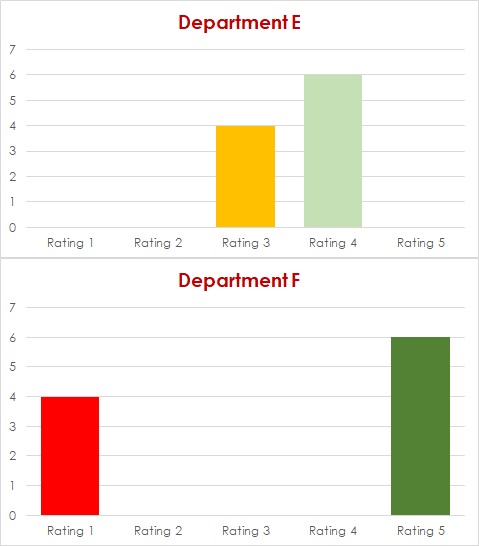
It is always advisable to try to understand the patterns demonstrated in data of your survey results. Since the survey rating is only showing values between 1 and 5, plotting data of much more than 10 raters using bar charts or column charts may not show much pattern. Still, in our simulation, the patterns are quite obvious (Figure 3). Whereas Department E displays a homogeneous rating between 3 and 4 by all ten raters, Department F seems to have two groups of raters. One group rates very low, another group rates very high.
Calculating the standard deviation for each department could help shading some light. Consistent rating, i.e. rating by a homogeneous group of raters would typically result in a smaller standard deviation, i.e. StdDev of 0.5 for Department E. Inconsistent rating, in other words, rating of different groups of people combined in Department F results in a larger standard deviation, i.e. StdDev of 2.1.
Are There Other Factors?
This usually means, there is an underlying factor, a lurking variable that might help explain this rating. In this kind of situation, it is advisable to stratify the data using all available demographics. In our case, rating 1 was given by Team 1, whereas rating 5 was given by Team 2. Team 1 and Team 2 have different supervisors who might handle target setting differently.
Having percentages is never enough. Even calculating averages will not always reveal the full picture. The standard deviation might help enriching your survey results by divulging more information about your survey data.
Keep digging into the details behind your survey data and you might find something that is not shown in percentage nor in mean nor in standard deviation (Figure 2). This will only be visible by using the right stratifying factor, the right demographics. This could be age group, tenure group, management level, substantive grade, staff scheme etc.
And, by poking into these details, you may find powerful levers for increasing staff satisfaction and engagement and, hence for boosting retention.
Hence, keep digging. The outcome is most likely worth the effort.
Conclusion
Although the shown simulations are based on extreme ratings that might not happen like that in any organisation, the impact of different rating patterns on rating results is very real. Therefore, some rules might help you understanding your rating results:
Don’t look only at percentages. They can be lies.
Looking at averages in addition to percentages improves the information content. To stay focussed and avoid getting lost in too many details, pay attention to significant differences only.
Understanding the patterns in data would be best. However, it is not advisable and most likely not even possible for you to analyse the raw data. Therefore, develop a list of potential stratifying factors and have them applied to your data by your market researcher hoping that by doing so you discover all potential patterns in your data.
Epilogue
Congratulations to you if all the above considerations are old news to you. You do have a basic understanding of Data Analytics, the foundation of Data Science. With the ever-growing availablility of all kind of data in basically all sort of organisations, it is necessary to have at least a fundamental comprehension of the procedures for acquiring, cleaning, transforming, analysing, interpreting and visualising data.
Don’t leave this kind of critical job to special units in your organisation, or worse, to external consultants.
We use cookies to enhance your experience while using our website. If you are using our Services via a browser you can restrict, block or remove cookies through your web browser settings. We also use content and scripts from third parties that may use tracking technologies. You can selectively provide your consent below to allow such third party embeds. For complete information about the cookies we use, data we collect and how we process them, please check our Privacy Policy
Youtube
Consent to display content from - Youtube
Vimeo
Consent to display content from - Vimeo
Google Maps
Consent to display content from - Google
Spotify
Consent to display content from - Spotify
Sound Cloud
Consent to display content from - Sound
We use cookies to enhance your experience while using our website. To learn more about the cookies we use and the data we collect, please check our Privacy Settings.