When I started dealing with data analytics, the focus was on learning the “sexy” statistics to help drawing business-relevant conclusions out of data. Graphical displays were always part of the job but done merely by the way. Only experience on the job taught me a lesson about the most critical step in data analytics: plot the data.
Plot the Data, Plot the Data, Plot the Data
All data analyses should be done in a two-step approach. Firstly, a set of graphs should be plotted to visualise the data. This visualisation alone may have the power to drive the decision and tell the story. Secondly, however, it is a good practice – and often a necessity – to support the graphical analysis with statistics.
Plots support the discovery. Statistics serve as confirmation.
Here are some hints for graphical analysis:
Plotting Only One Graph is not Enough
Showing more than one is not necessary.
There is a wide range of different graphs available. Various software is able to plot a large assortment of graphs. However, the graphs you need are almost always the same.
Which plot is the best? There is, of course, no universal answer. It depends on the data you want to plot and the message you want to bring across.
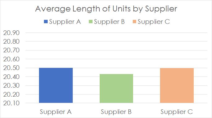
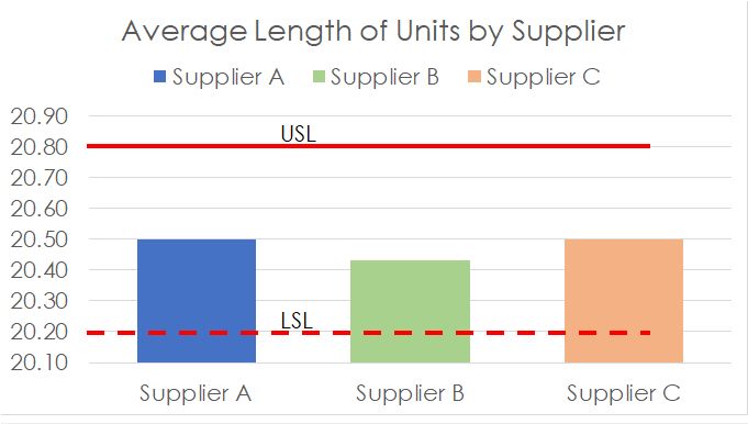
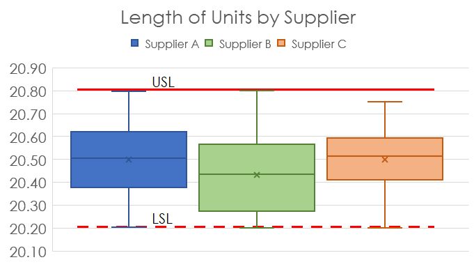
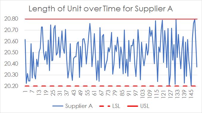
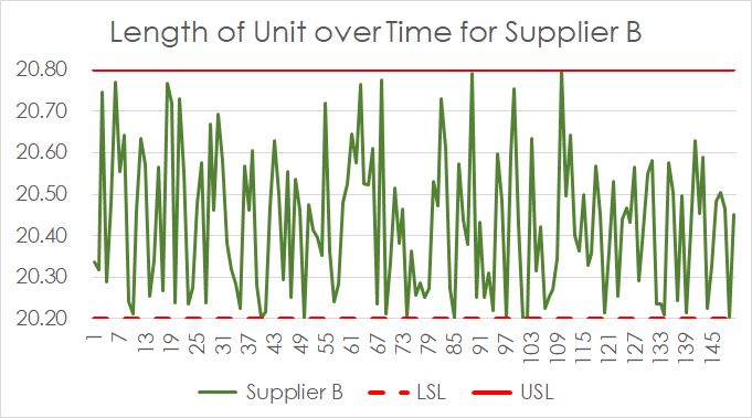
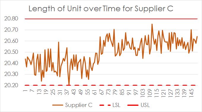
For example, a client was looking into selecting a supplier for a critical part, the spacer. The length of this production unit must be between LSL = 20.2 and USL = 20.8.
They had asked supplier A, B and C to deliver an initial sample for inspection. All data meet the requirements, hence the yield is 100% for all. The column chart showing the average length suggests that all are good, right?
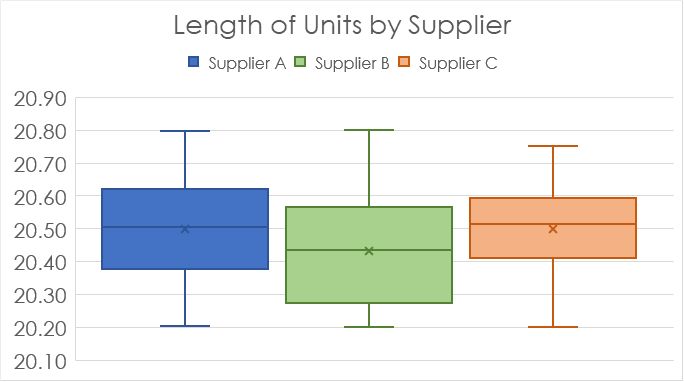
Means are lies. Check the variation. Plot the data.
That would be a wrong conclusion. Never make decisions based on means. Investigate what the mean is made of, the variation of the data.
There are many different ways for displaying the variation of data. The box plot is certainly one that comes to mind.
This is a very powerful plot informing about the minimum, the maximum, the range, the mean and the quartiles of the data for all suppliers.
All meet the requirements, i.e., all are good, right?
Most data are not static. Show them over time. Plot the data.
More often than not, it is wise to look at the data over time. Time might be an indicator showing the influence of different work shifts, teams of operators or many other conditions that change over time.
They might be latent. You want to know this!
From the box plot, we have learnt that all suppliers have a similar range in their batch that fits within the specification limits. However, this does not mean that all of them have the same variation. Supplier C shows remarkably less. The plot helps to discover that the large range at Supplier C is caused by two different batches. Find the root cause, confirm it and you might have a great supplier!
By the way, the impression of relatively large variation in the batch of Supplier B was indicated already by the large box in the box plot. Calculating the standard deviation gives 0.15, 0.17 and 0.12, respectively. After removing the shift in the C data, we can even expect much less standard deviation.
Hence, Supplier C should be considered. If you need to explain your decision, the time plots will probably serve you best in this situation.
There are many other plots that are suitable to help for this set of data. Control charts, violin plots, histograms and dot plots are just some examples. With a normality test and a subsequent calculation of the expected yield assuming normality, you will be able to predict what you get from all three suppliers.
Dressing up Your Plots is Key
Don’t let your audience guess. Tell them!
Although MS Excel and MS Power BI and any other software do a great job in suggesting the best settings for your graphical data displays, it is usually necessary to do the final “cosmetics” yourself.
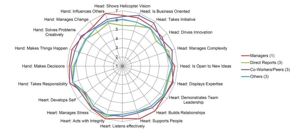
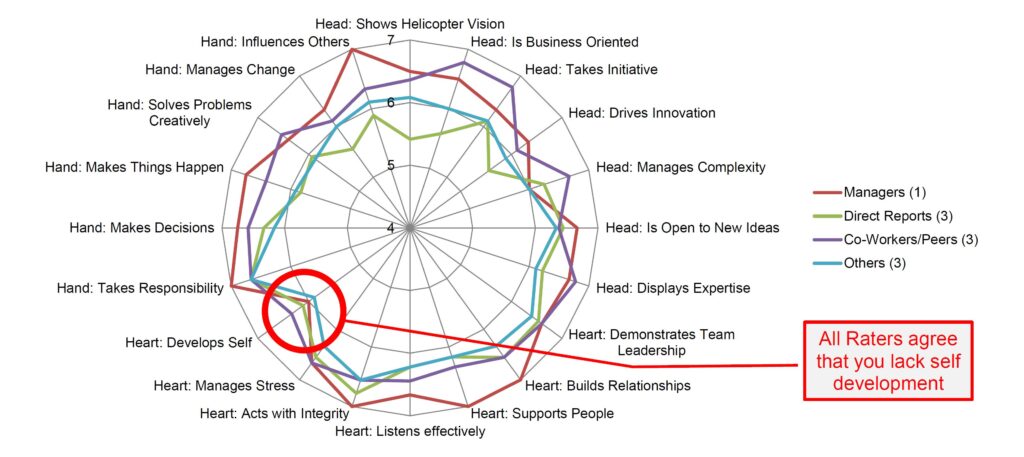
Radar charts should be used sparingly. The radar chart displays 360degree feedback by different rater groups (Manager, Direct Reports, Peers, Others) on 20 competencies.
Is there anything remarkable? Probably not.
Just changing minimum and maximum of the axis makes a huge difference.
Additionally, make sure colours of bars and lines are distinguishable from each other.
And, increase the size of the text in a way that allows readers to get it without any problem. Keep in mind, they may open it on the hand phone.
Conclusion
A picture says more than a thousand words.
“A picture says more than a thousand words.” This is the same in data analytics. Plotting your data is a major task on your data analytics journey. Never miss this step. Some of the information acquired through a plot cannot be obtained by statistical tools.
There is no universal truth about the best way for plotting data. Here are some tips that help me whenever I try to get information about data at hand:
So, what exactly drives your staff to
Always plot many plots and versions thereof because it is hardly the first one that helps you explain your data. Plot many but show only very few.
Show information of the three key characteristics (1) central tendency, (2) variation and (3) distribution.
Investigate patterns over time. These may hint to lurking drivers like work shift, operator, supplier, equipment, etc.
Do not forget to beautify your final graphs. Never accept the graph you get out of the software. You can always make it better. Find some more hints here.
We use cookies to enhance your experience while using our website. If you are using our Services via a browser you can restrict, block or remove cookies through your web browser settings. We also use content and scripts from third parties that may use tracking technologies. You can selectively provide your consent below to allow such third party embeds. For complete information about the cookies we use, data we collect and how we process them, please check our Privacy Policy
Youtube
Consent to display content from - Youtube
Vimeo
Consent to display content from - Vimeo
Google Maps
Consent to display content from - Google
Spotify
Consent to display content from - Spotify
Sound Cloud
Consent to display content from - Sound
We use cookies to enhance your experience while using our website. To learn more about the cookies we use and the data we collect, please check our Privacy Settings.