Get a Quote

Analytical Storytelling

Analytical Storytelling

A Competency for Analysts and Leaders

Today, there is much enthusiasm in organisations about data analytics and data science. It is obvious, that the job of data analysts is not done with the completion of the analysis. Consequently, the job of data scientists and analysts includes translating and communicating the analysis results in organisational language, it includes Analytical Storytelling.

But, communicating about analytics has not traditionally been viewed as a subject to the education of quantitative analysts. Typically, those with strong methodical orientation are heavily focused on the analytical procedures and not too much how to communicate effectively about analytics.

However, the job of a data analyst is not only to collect and validate representative data, clean, transform and analyse that, but also to translate the statistical message in a way that is understandable, compelling and interesting enough for taking it into account when planning strategy and making decisions.

People do hardly remember numbers. But, they remember pictures, and stories that are created and inspired by these pictures. Therefore, picturesque storytelling has become an important skill in organisations. I.e., if you can pack your message in a good story, you have a better chance of “selling” it, of convincing your audience.

Telling a good story means ensuring it AIDS your audience:

  1. Who is your Audience? What is their education, their job and hence their appetite for details?
  2. What is your Intention? Do you wish to inform them only or do you want to trigger action?
  3. What is the Best Way for Displaying the Information? What is the best chart supporting your intention?
  4. How can you Simplify your Pitch? How can you translate your information into the language of your audience?

Who is the Audience?

Tailor your Pitch for Them

A certain story may work very well for this audience but not for that one. For instance, an average group of middle management in a healthcare setting has a limited appetite for statistics. A group of scientists from a blood lab expects details. They need statistics and will be disappointed if you cannot explain it. They will most likely challenge you. Know about your audience and think what is important to them, what concerns them and what is their educational background.

What is the Purpose of Your Presentation?

Repeat the Key Message
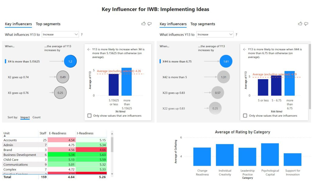
Consider the intention for your presentation. What do you want the audience to do with your data? Is it only for information purpose or does the dataset need to be seen as important enough to drive a business decision? Ensure your audience “gets your message”.

And, please repeat the key message multiple times. For example, Will Smith once quipped about making a convincing presentation in three steps:

Firstly, tell them what you are going to tell them.

Secondly, tell them.

Thirdly, tell them what you told them.

This remark certainly carries some truth. Putting the key message in only one sentence as a conclusion at the end of your story might not be enough. Depending on the length of your pitch, you might have lost your audience before you get there.

How to Show Data?

Analytical Storytelling Made Interesting

These days, there are new tools to communicate the results of analytics and you should be aware of the possibilities. Of course, the appropriate communication tool depends on the situation and your audience. Additionally, the data type helps you decide the tool to use. Not everything can and must be shown with bar charts or line graphs. We can do better than that. A bar or column  chart is a last resort.

Column Chart – Box Plot – Violin Plot

These graphs illustrate the different story you can tell with a box plot versus a column chart. The column chart only illustrates the mean of your data sets. After you have mentioned that CHL Blue takes in average longer than all other teams and CHL Orange is the fastest team, your story ends.

The box plot, however, reveals that the Blue team not only is the slowest but also shows a huge variation. The fastest performance for Blue is faster than any other team’s best performance. The longest delivery time for Blue is at 31 minutes. Unfortunately, 50% of all Blue deliveries take longer than the slowest delivery of team Orange and team Red.

The violin plot adds more information about the distribution of data in an easy and attractive way. I bet, people want to learn to plot like that.

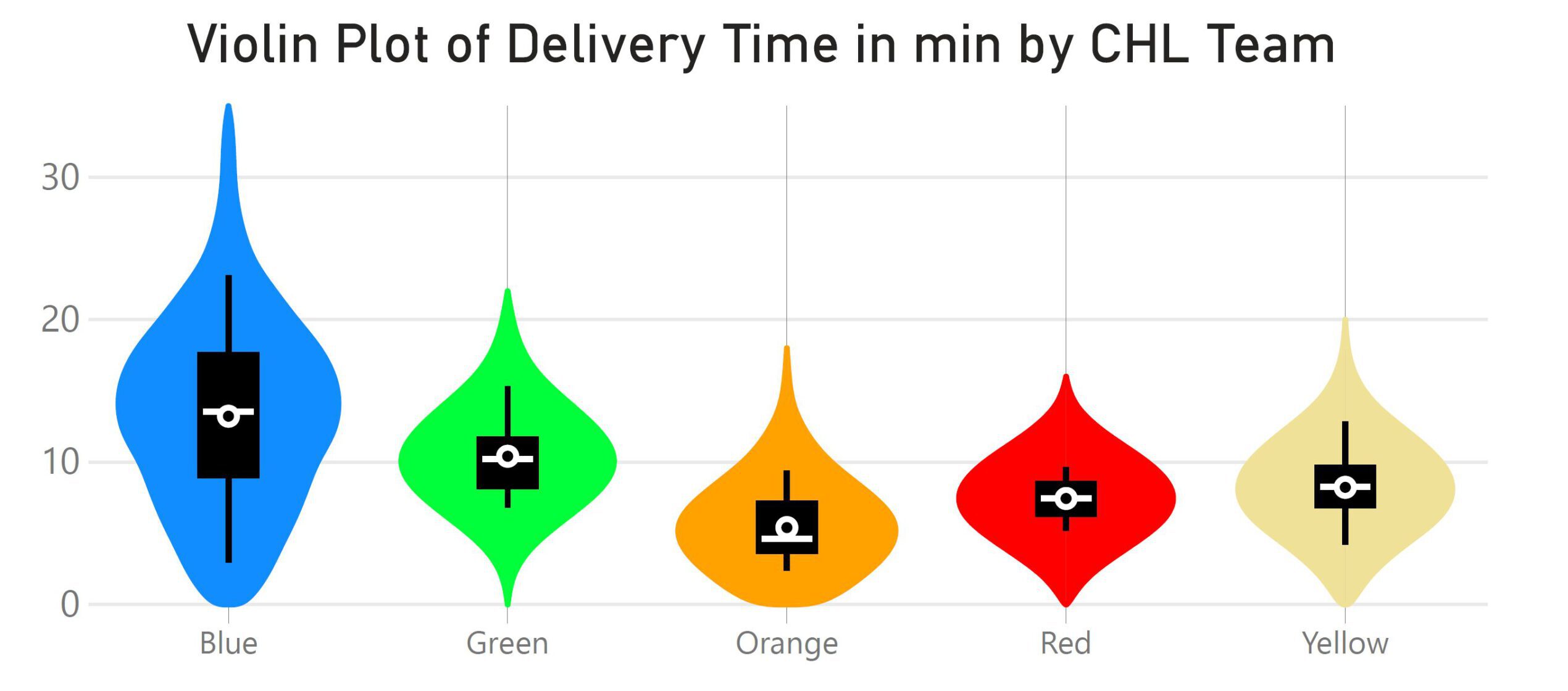
Replace your bar charts with box plots or other alternatives, if possible.
Your audience will highly appreciate it.

Column Chart – Marimekko Chart

Not every chart sends the correct message to the audience. The next column chart compares the payment discipline of four different business units regarding their supplier invoices. It displays the percentage of invoices settled on time versus late invoices. It seems that the biggest problem exists in Business Unit 1 where 95.8% of all supplier invoices paid late.

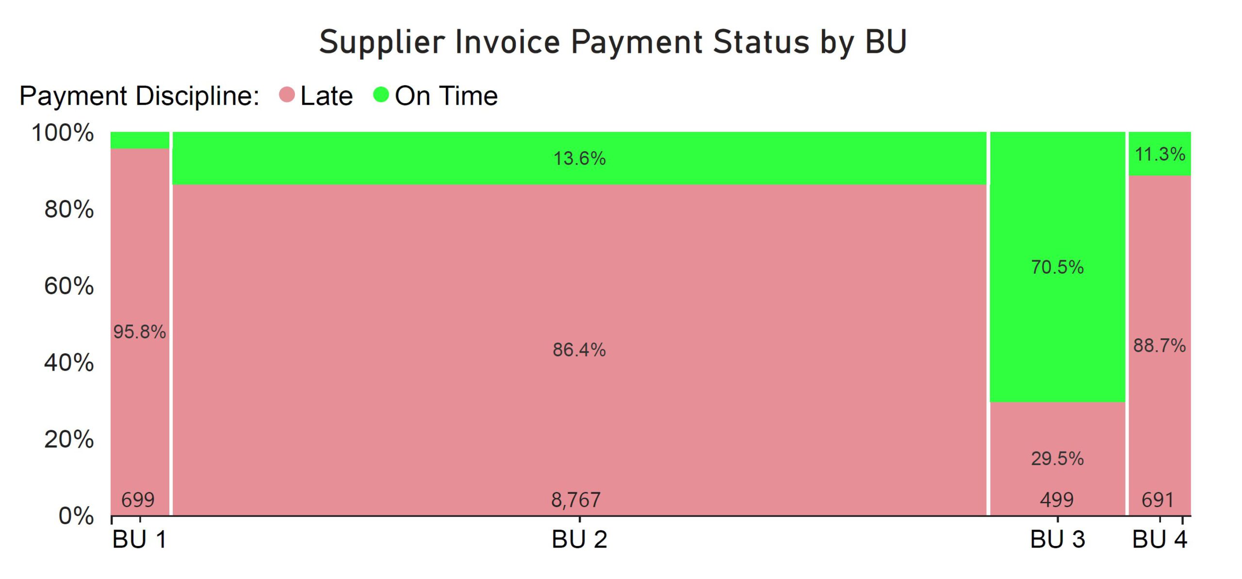
However, the following Marimekko chart (mosaic plot) illustrates the number of invoices received by each unit. It shows that BU 2 has many more suppliers waiting to get paid than all other units together. BU 2 is the real problem.

Before plotting data, be sure about your intention. In other words, different charts carry different messages.

How to Simplify the Presentation?

Analytical Storytelling for Non-Analysts

Don’t Do That

Let us take a look at this message presented to the senior management:

“Last year, the satisfaction score of our loan customers was at 67%. After stratifying the data into loan type, we found that the score was especially low for type 1 and type 3 customers with 52%. Type 2 customers were more satisfied with 88%.

After changing the process of loan application with focus on type 1 and type 3 loans, our average satisfaction score is now at 80% with type 1 at 79%, type 2 at 90% and type 3 at 73%. This change is significant with a p-value of 0.0141 as a two-proportion-test confirmed.

Therefore, we suggest to roll-out the change since we will certainly increase customer satisfaction.”

Although your management undoubtedly appreciates the result that leads to increased customer satisfaction, they may not welcome the “statistics talk”. Part of the reason might be, that some of them will not know what you are talking about, but they will not show that, and hence they will not ask you for clarification.

Present the Result Like That

A statement like “Our market research has shown that 10% increase in customer satisfaction might lead to 3% growth in market share, hence we should be able to increase our market share by about 7% if we implement our solution” will hit the nerve of the management.

No one needs to know about the tools used and the p-value as a result. The p-value usually stands for a risk: “The risk for investing in the new process and not getting any return is quite marginal with 1.4%. Hence, I suggest we do that.” is a much clearer message. Risk is management talk!

If someone in your audience is interested in the tools you have learned and applied, have this information on backup slides. This shows that you are prepared. Demonstrate what you have learned if they ask. After all, they probably sent you to a data analytics course for that purpose.

Conclusion

In conclusion, storytelling is not a new management discipline, because strong leaders tell stories to convey information and motivate listeners. Most importantly, analytical storytelling, when tailored to the audience’s characteristics, can help anyone or any organisation refine their thinking, improve their decision quality and inspire action (Cognizant).

Your Success as a Data Analyst Depends on Your Capability to Communicate.

Finally, this article is extracted from “Data Analytics for Organisational Development” , which is available in English and German language. More Details.

In that book, analysis is done using easily available tools like MS Excel, MS PowerBI and R with all data being offered for download to follow through these analysis steps.

Read more about Data Analytics in typical situations of Organisational Development. Ten cases show nuts and bolts of the analysis steps:

  1. Formulating a relevant Business Question,
  2. Acquiring the necessary Data,
  3. Preparing, i.e. transforming, cleaning the Data,
  4. Analysing the Data,
  5. Answering the Business Question.
Print Friendly, PDF & Email
analytical storytellingdata analyticsdata scienceorganisational development

Uwe H Kaufmann

Dr Uwe H Kaufmann is the founder of Centre for Organisational Effectiveness (COE Pte Ltd), a business advisory firm operating out of Singapore. As consultant and coach with many years of experience, his passion lies in supporting organisations to improve their effectiveness.
Uwe is a German national and Permanent Resident of Singapore. He has four children and nine grandchildren … and counting.

Categorised Tag Cloud
Privacy Settings
We use cookies to enhance your experience while using our website. If you are using our Services via a browser you can restrict, block or remove cookies through your web browser settings. We also use content and scripts from third parties that may use tracking technologies. You can selectively provide your consent below to allow such third party embeds. For complete information about the cookies we use, data we collect and how we process them, please check our Privacy Policy
Youtube
Consent to display content from - Youtube
Vimeo
Consent to display content from - Vimeo
Google Maps
Consent to display content from - Google
Spotify
Consent to display content from - Spotify
Sound Cloud
Consent to display content from - Sound