Whenever I entered the management team meeting at MyBank, I had my state-of-the-art PowerPoint pitch showing the performance of each department and its core processes as part of our dashboard. Every month, we got the latest underlying data together, aggregated them and displayed an overall dashboard of how the business was doing. With that, we had a clear Line-of-Sight.
For this particular month, my dashboard highlighted only one indicator pointing south, i.e. showing a significant decrease in performance. The traffic red highlighted “Client Management” (Figure 1). Client Management is the business unit that handles our relationship with dealers and retailers in the different industries. They issue our loans for Sales Financing.
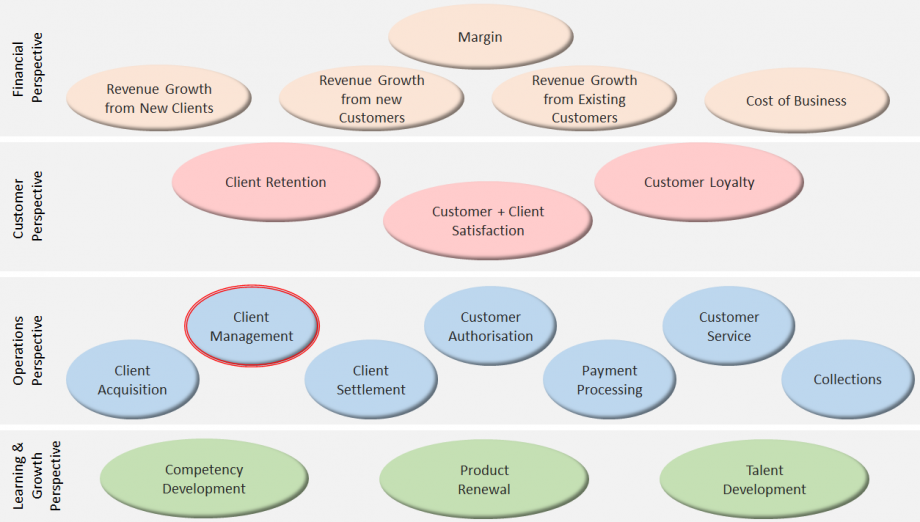
Getting a Balanced Perspective with a Line-of-Sight
Why Dashboards?
- Raising awareness for some key indicators among managers and employees. This alone leads to some initial improvements – due to the Hawthorne Effect,
- Building a cause-and-effect mind-set, especially in the process of constructing the driver tree. This driver tree shows leading indicators that drive lagging indicators and serves to give a clear line-of-sight to the process owners. They will be able to see – and often quantify – the impact of their performance on customers and financials,
- Creating appreciation for simple statistical principles like control charts. They are used to identify the appropriate action in case the dashboard shows signals.
How to Develop Dashboards?
Preparing the Dashboard
- Collecting existing indicators that make the initial driver tree. Some organisations are data rich, some are not. Building an inventory of the existing data is necessary – and often full of surprises. Not many businesses use this data in a driver tree with established cause-and-effect relationship. More often than not, the selection of KPIs is based on gut feel fed by a good portion of business knowledge. Almost always, it is necessary to amend the set of indicators after inventorying and evaluating them.
- Designing the dashboard for different levels is a rather creative activity. It involves decisions about which indicators to bring to whose awareness, how to show these indicators and how to set thresholds. Rule of thumb: not more than 10 to 12 indicators in one dashboard.
- Setting up the data collection system is a vital task. The quality of the data in the system determines the quality of information obtained and decisions made. Therefore, the data collection system should ensure that the right amount of relevant and representative data is available. Evaluating repeatability and reproducibility of the data collection system might be necessary.
Using the Dashboard
- Making the dashboard operational is about change and needs proper change management. It usually takes time, training, motivation and a great deal of role modelling by the leadership team to establish dashboards and the right mentality in using them. Start with the obvious indicators that are neither doubtful nor difficult.
- Revising the metrics is an ongoing task that should be part of the annual or bi-annual planning process. It needs time and some trial-and-error to establish effective dashboards showing numbers that really correlate with customer satisfaction and business success.
Conclusion
Building dashboards is a project itself. Their ongoing review and adjustment is as important as changing strategy or processes. Reading business indicators is a management task that requires preparation, focus and the willingness to embrace cultural change. Using dashboards combined with effective data analytics, process management and appropriate process improvement interventions are powerful in steering the business and in ensuring the organisation’s continuous learning and renewal. An effective dashboard with appropriate indicators gives the management a clear line-of-sight to the business objectives.
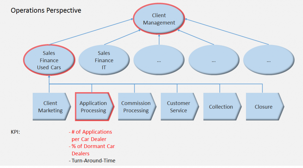
The project at MyBank did not take too much time. It revealed some obvious drawbacks in our processes. Firstly, our new conditions, i.e. better interest rates have not been communicated to all dealers. Hence, they used other banks for financing sales. The root cause was found to be a mismatch of our car dealer database with the marketing database. Marketing was working with “old” data. Secondly, our sales reps tended to call car dealers whom they are comfortable with.
This means they mostly called car dealers who were active anyway. For both process problems, corrective actions were introduced and monitored. As a result, Gerald’s dashboard has been amended to show the car dealers who have not been contacted for a certain period. This was a leading indicator that was very helpful in keeping current with the status of our communication with our car dealers – long before the relationship could turn sour.
Uwe H Kaufmann: Managing with Dashboards. Rath & Strong’s Six Sigma Leadership Handbook, John Wiley & Sons, 2003