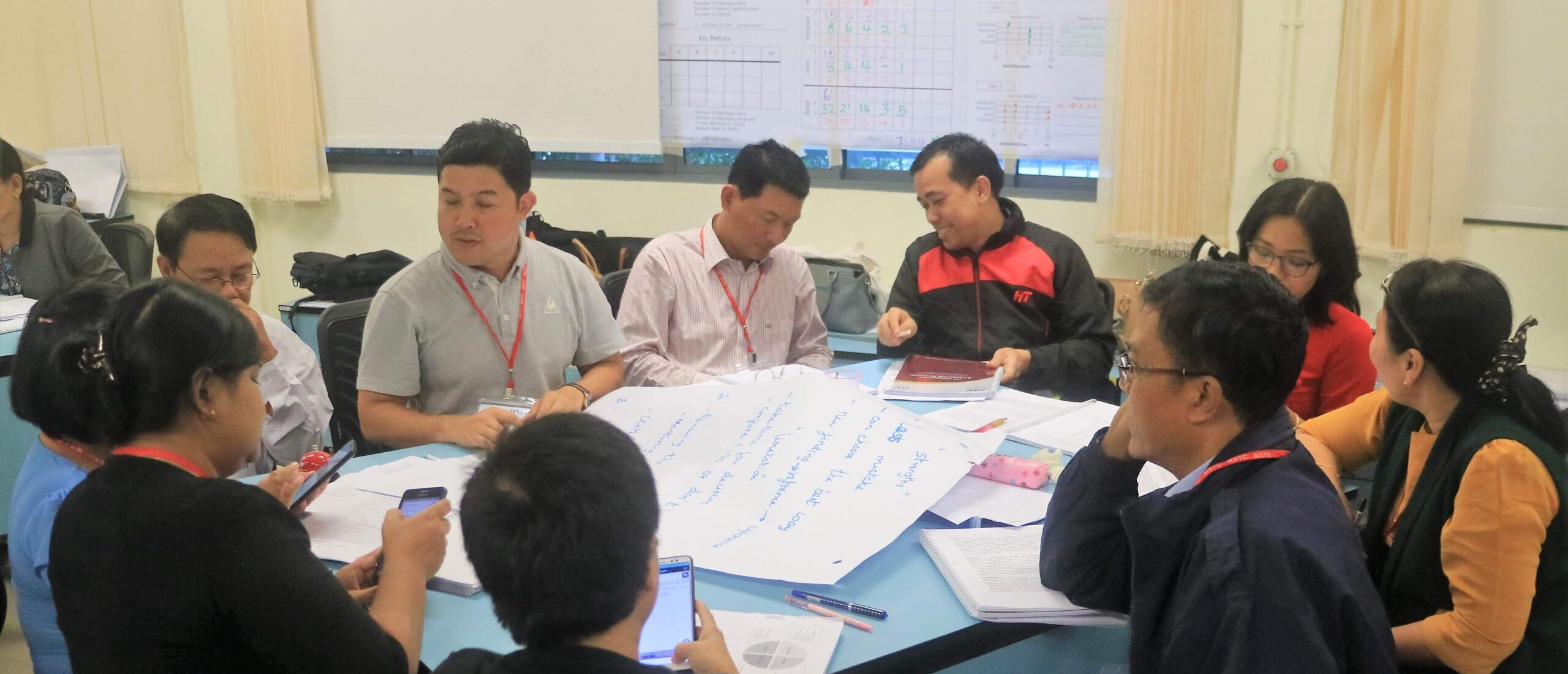
Process mapping represents a workflow visually, which allows the team to understand the process and its components more clearly.
There is a variety of process mapping approaches such as SIPOC maps, activity flowcharts, spaghetti flowcharts, deployment flowcharts, customer journey maps, value stream maps and many more. Such process maps are the foundation of methods like Lean Six Sigma, Lean Innovation Training, Business Process Reengineering and others.
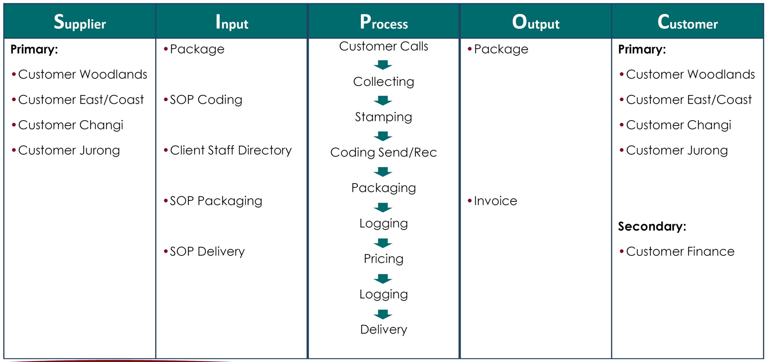
A SIPOC is a high-level process map that shows a process with its customers, and required outputs as well as suppliers and their necessary inputs. More often than not, customers and suppliers are part of your own organisation. Your colleagues in other departments or other stakeholders that are connected to your process. This method is said to be developed along with the Six Sigma tool set.
The SIPOC is often used at the very beginning of an improvement project. The aim is to get an overview of the process and align the team’s understanding.
The aim of a hi-level process map is to identify the process boundaries for the project (start/stop) and create a common understanding about the process within the team and between team and project sponsor.
The process map is created starting from the customers of the process and the outputs that they are demanding.
A SIPOC process map should be hi-level containing not more than 5-8 process steps.
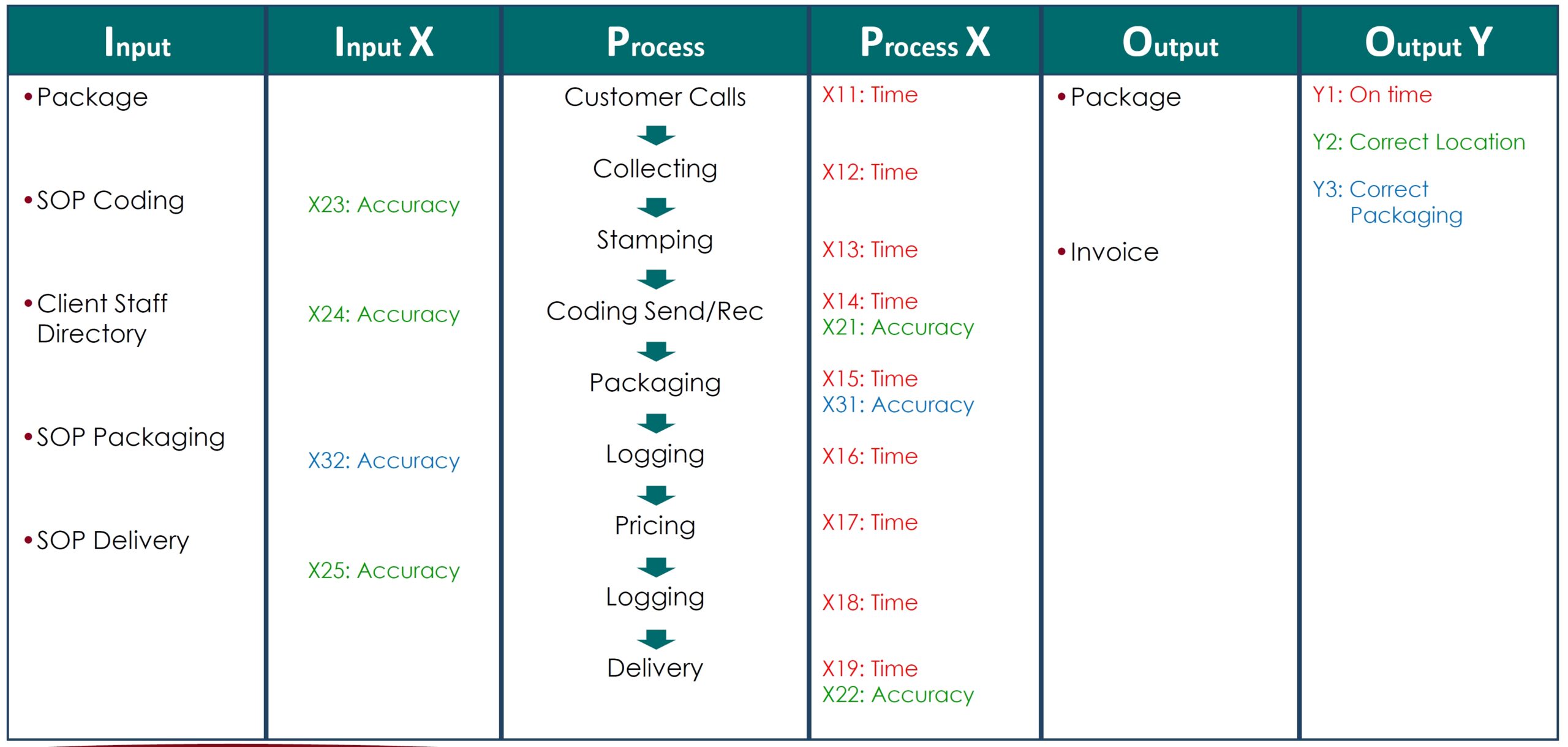
Problems on process outputs, measured as output Y, will help identifying potential root causes on process steps, process X, or on inputs, called input X.
In the example shown, an incorrect packaging (Y3) can only be caused by incorrect packaging process (X31) or by incorrect SOP packaging (X32).
This logic helps to focus root cause analysis.
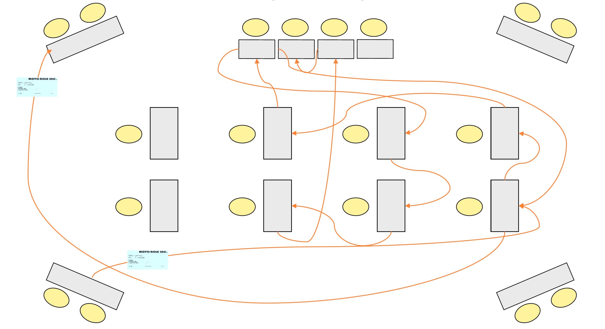
A spaghetti flowchart is a powerful visual representation of the flow of goods, information or people in the process.
The spaghetti flowchart helps identifying an omnipresent element of waste, the movement.
More often than not, organisations lose a large portion of their productivity and efficiency through unnecessary movements of goods, people and, to a certain degree, an uncontrolled flow of information.
This flowchart offers insights into this flow in a visually impressive way.
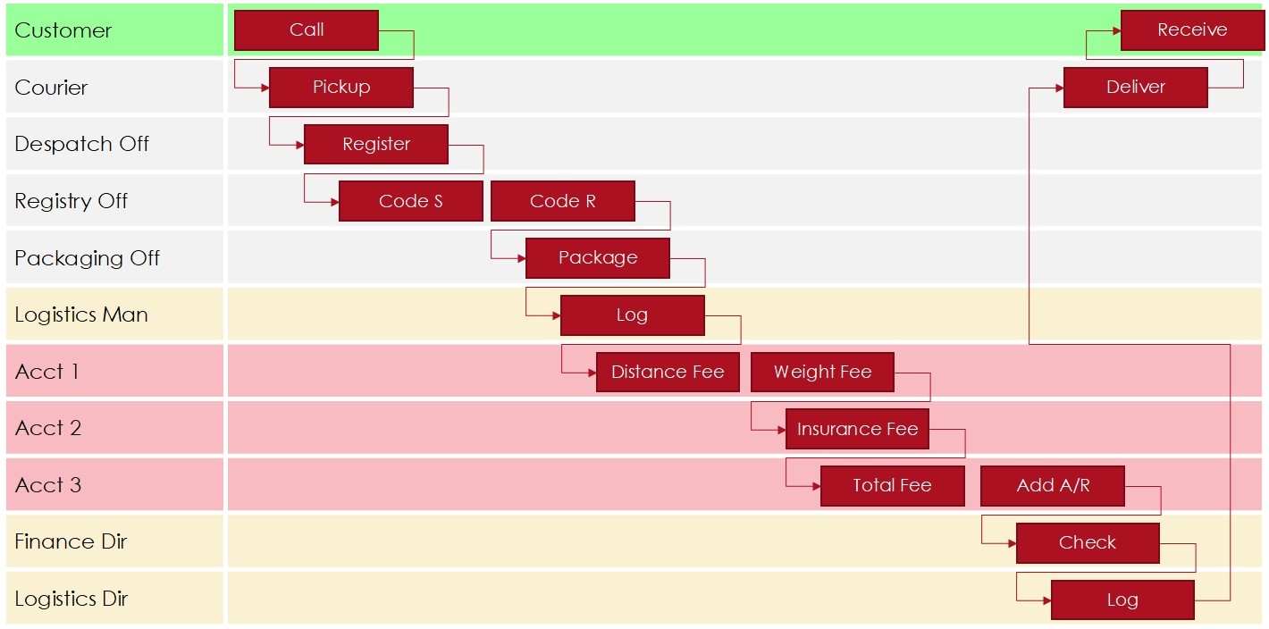
A deployment flowchart is a powerful visual representation of process steps and interfaces between them.
The deployment flowchart helps identifying a very prominent driver for waste in a process, process interfaces.
More often than not, organisations lose a large portion of their productivity and efficiency through a lack of communication between different process stakeholders, i.e., when handing-off the result of their own work to the next position. This usually leads to multiple calls or emails for clarification, i.e., rework and even a considerable amount of defects .
This flowchart is usually combined with a value stream analysis to make the results of communication issues even more obvious and measurable.
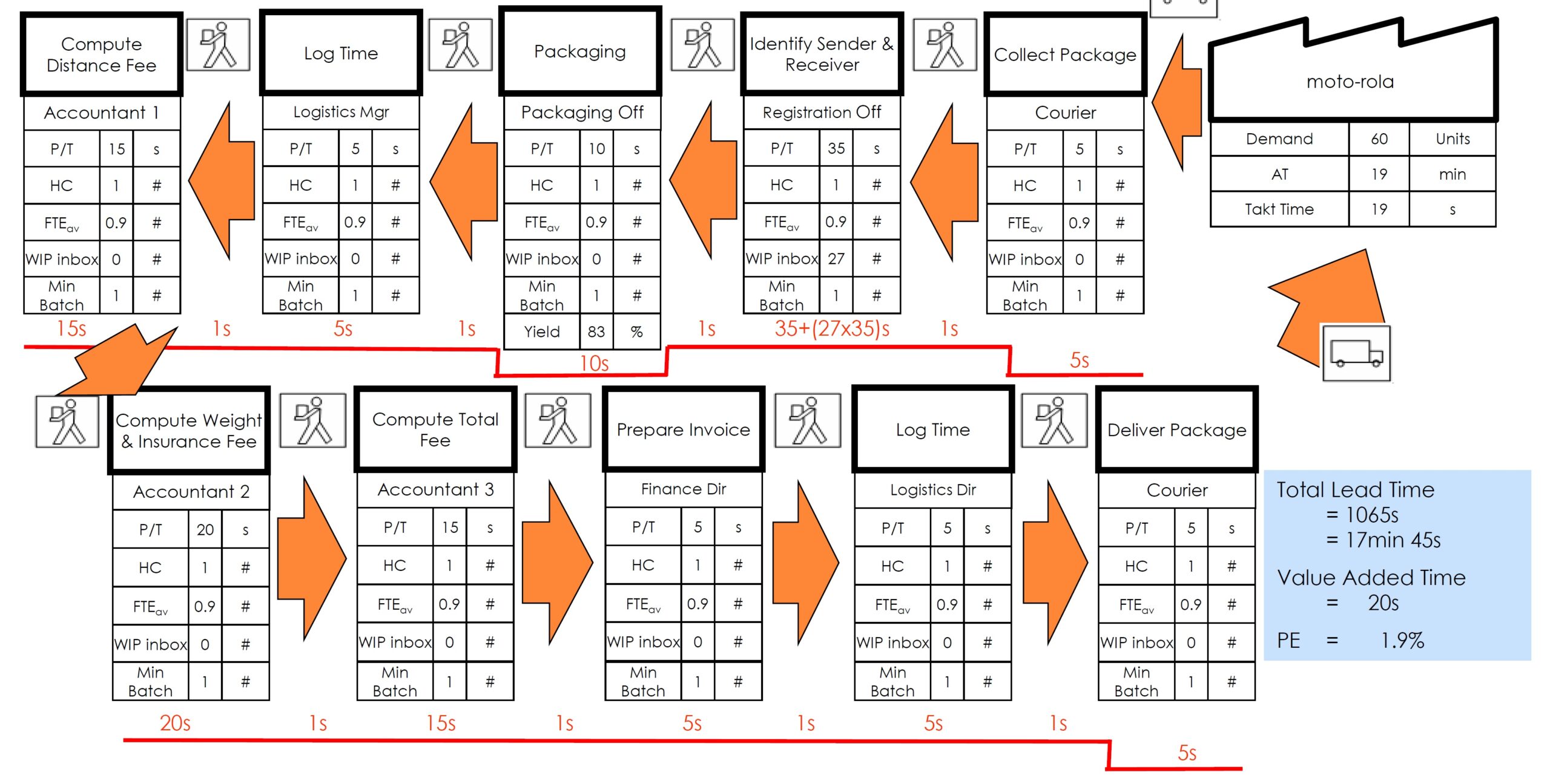
A Value Stream Mapping is a lean management method for analysing the current state of the series of events that take a product or service from the beginning of the specific process until it reaches the customer.
A value stream map is a visualisation tool that displays all steps in a specific process and easily quantifies the time taken at each stage. Value stream maps show the flow of both materials and information as they progress through the process.
Depending on industry, process characteristics and purpose of the mapping, additional information can be added to every process step to highlight potential process gaps.
After studying the process flow carefully, weaknesses leading to reduced efficiency and delayed delivery are highlighted.
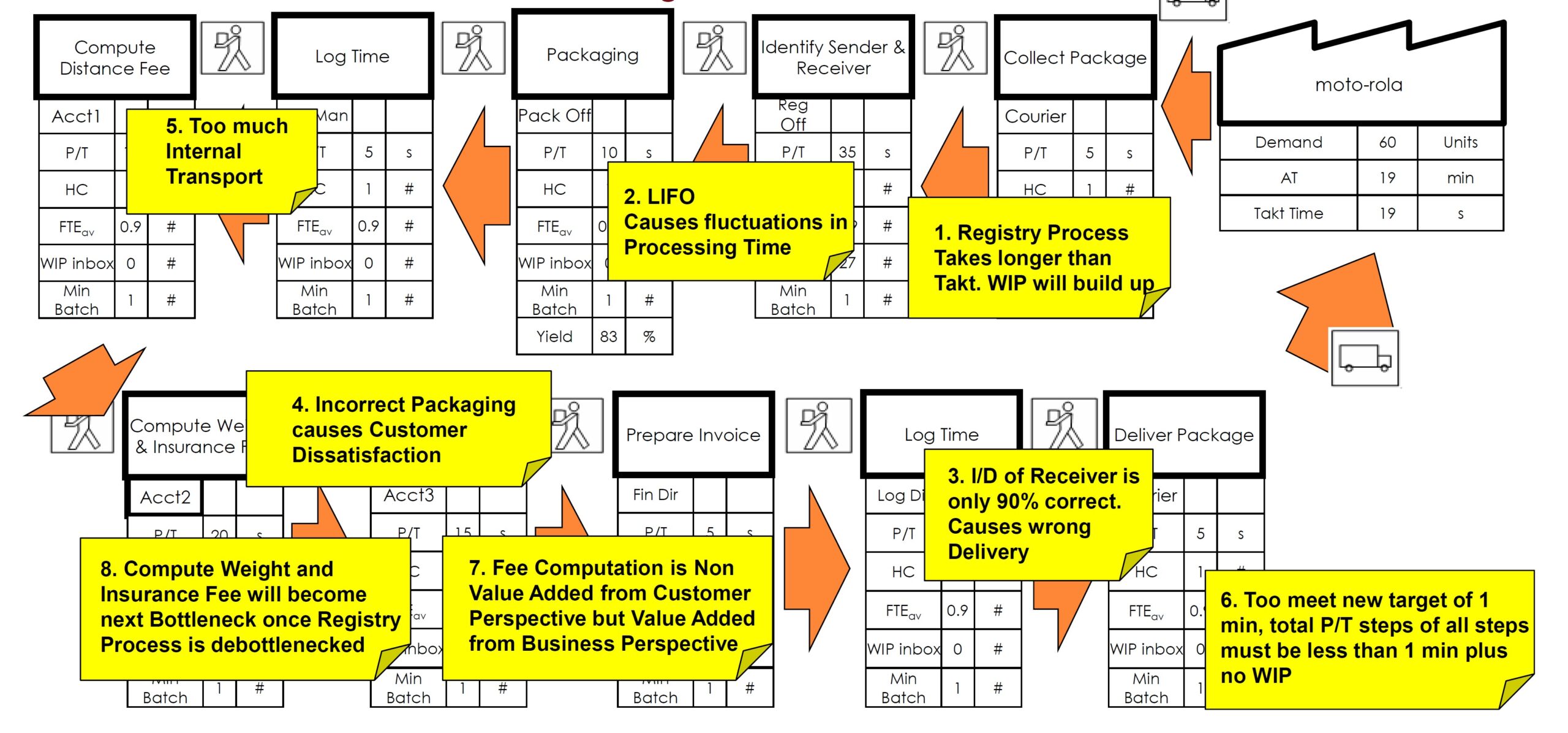
A map with these problem areas can be used as input for a creative problem solving session.
Although staff may most likely mark their process steps as value-added, from the perspective of the customer they are not.
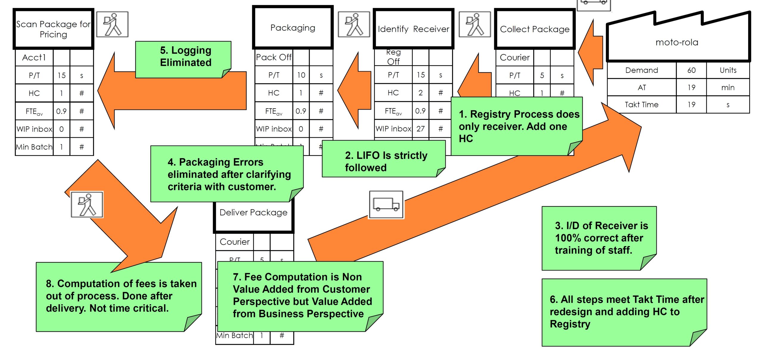
As a result of the mentioned creative problem solving session, problem areas are tackled with specific solutions and some non-value-added steps have been eliminated resulting in remarkably improved performance.
This effect can be observed during our impactful CHL workshop as part of a Lean Innovation introduction.
In summary, this map helps identifying waste in multiple forms, summarised in TIMWOOD.
Although the above mentioned methods can give some vital information for assessing the proper deployment of the workforce, workforce planning activities might additional facts.
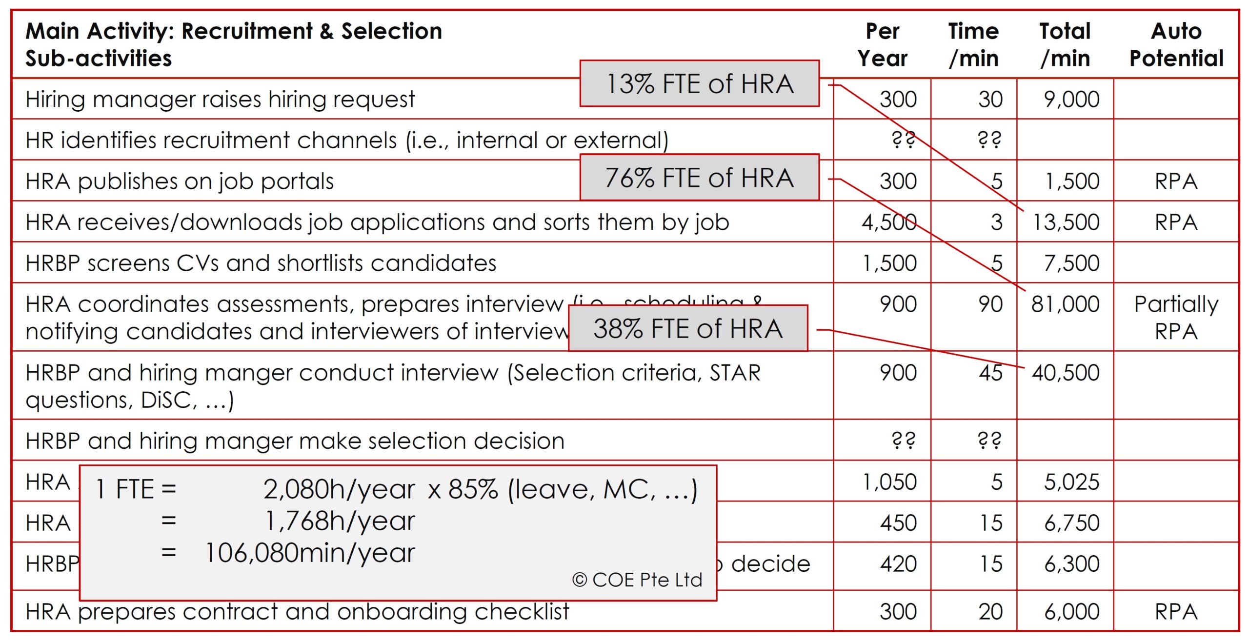
The following table highlights some more critical details. This will help for improving and automating a process before planning workforce for it.
Contrary to above mentioned methods, that give only a snap shot of the process, this way of collecting process information highlights the volume going through each step per time slot, in this case per year.
This map helps prioritising improvement efforts and suggest room for automation.
Finally, this process mapping method reveals improper workforce deployment. Mundane, routine tasks that happen often in a similar way might be candidates for simple automation by RPA. Humans should not touch them.
In conclusion, process mapping is a vital activity in many organisational development initiatives such as
It helps understand the flow of steps, information and staff and suggests room for improvement.